Area Real Estate Advisors
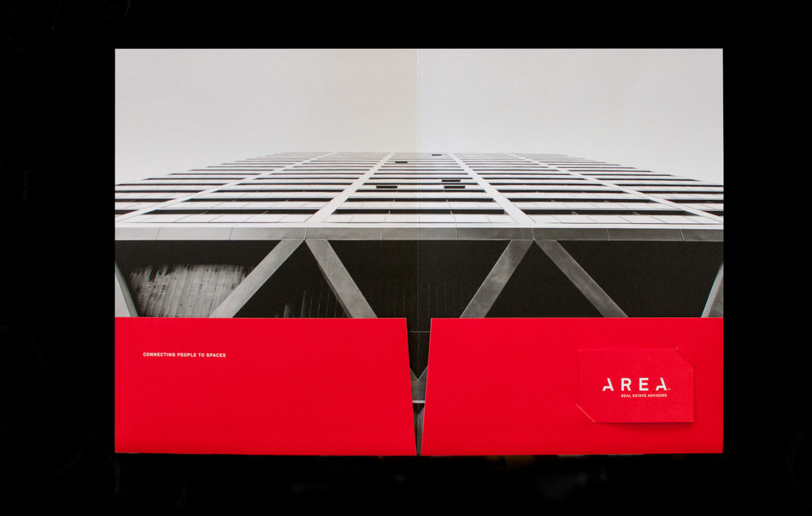
Connecting people to spaces

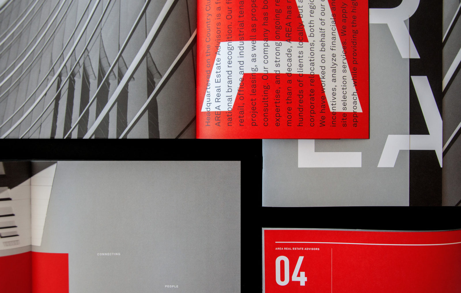
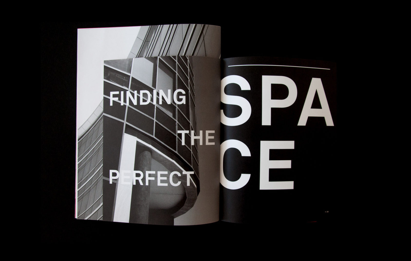
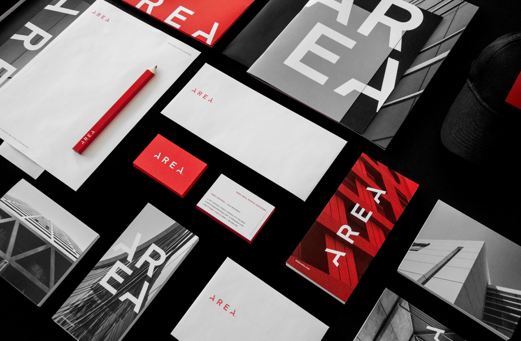
The new owners of RED Brokerage recognized the need for a fresh name while maintaining a connection to the RED brand’s history. Alongside the new name, they sought a new logo and language system to align with the rebranded identity.
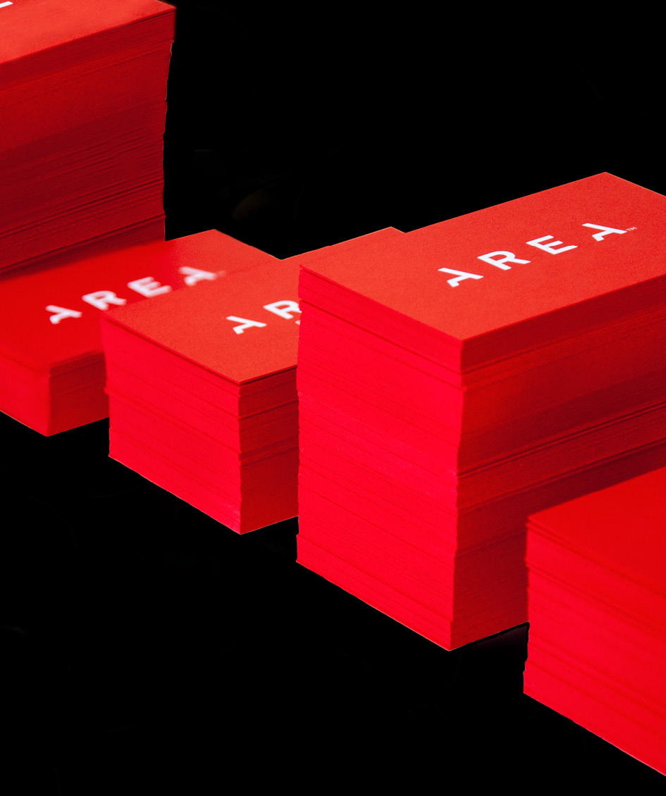
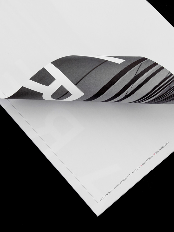

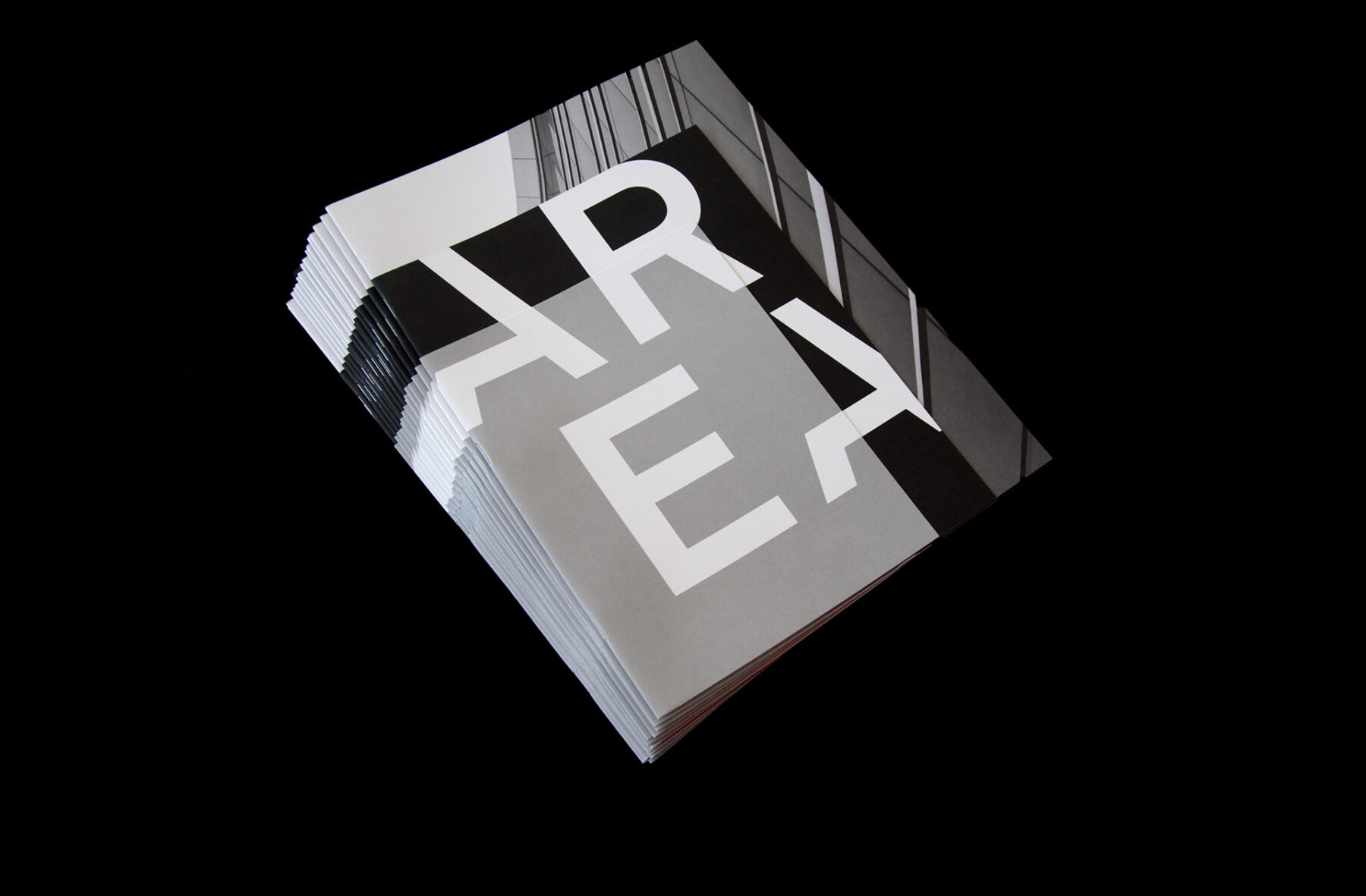
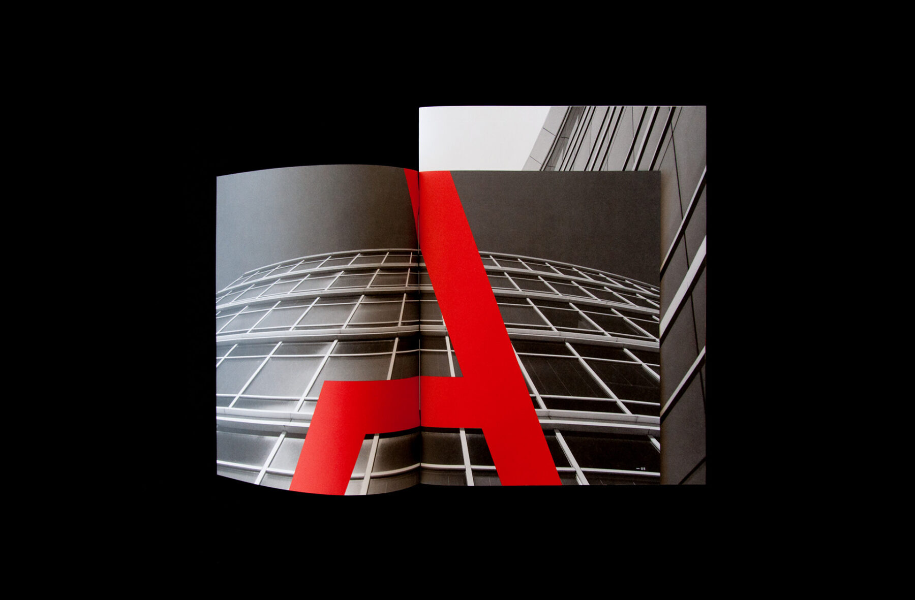
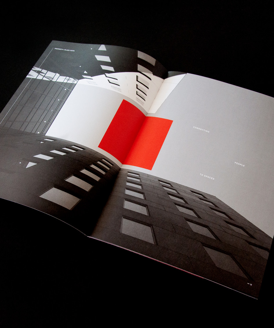
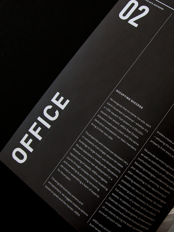
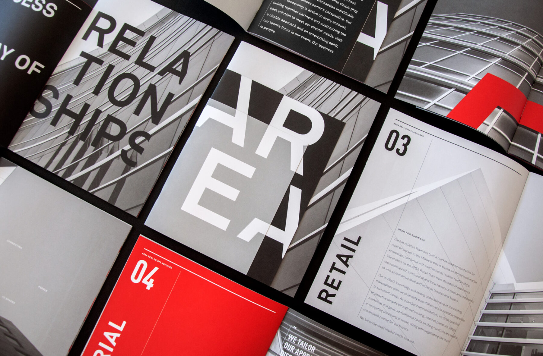
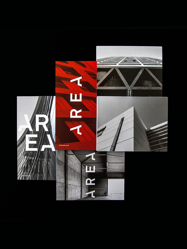
Design Ranch arrived at “AREA Real Estate Advisors” as the solution. Similar to RED, standing for “Real Estate Development,” AREA also functioned as an acronym for the company name. However, AREA’s significance surpassed being just an acronym; it became an integral part of the company name, symbolizing the firm’s creative ability to link individuals and spaces. Design Ranch’s kinetic logo, detailed language system, and dynamic visuals helped distinguish AREA as a unique entity while retaining ties to its heritage. The revamped branding and identity resulted in a twofold increase in incoming clientele for AREA and facilitated the company’s expansion, marked by introducing a multi-family division.




“After our rebranding efforts in 2016, AREA’s client base doubled in size, which resulted in the launch of a Multi-Family Division at the start of 2018.”
